TravelLocal - UX Audit & UI Redesign
Supporting User Engagement Through UI Design Improvements

Overview
ROLE
UX/UI Designer
TEAM
Solo Project
DELIVERABLES
UX Audit
UI Redesign of 1 Desktop page
DURATION
5 weeks
How I decided to conduct a UX Audit for TravelLocal
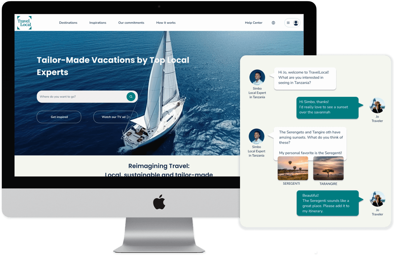
As a traveler passionate about authentic experiences and connecting with local cultures, I was naturally drawn to TravelLocal—a platform that connects travelers with local experts to design personalized trips while promoting sustainable tourism. After exploring the site and discussing it with a friend who works there, I noticed several UX and UI issues. This prompted me to conduct a UX audit to identify areas for improvement. Given the constraints of time and resources, heuristic analysis proved to be the most effective approach to quickly uncover potential problems by following the main user journey and identifying pain points without the need for user interviews.
As a traveler passionate about authentic experiences and connecting with local cultures, I was naturally drawn to TravelLocal—a platform that connects travelers with local experts to design personalized trips while promoting sustainable tourism. After exploring the site and discussing it with a friend who works there, I noticed several UX and UI issues. This prompted me to conduct a UX audit to identify areas for improvement. Given the constraints of time and resources, heuristic analysis proved to be the most effective approach to quickly uncover potential problems by following the main user journey and identifying pain points without the need for user interviews.
Communication challenges on TravelLocal’s platform
Communication challenges
Planning a trip can be an exciting experience, but ensuring effective communication between users and local experts is crucial for a smooth process. After planning a trip on TravelLocal's platform and selecting all the relevant options, the user receives an email from a local expert. However, users do not always respond, with the response rate to the initial offer email being only 30%.
Planning a trip can be an exciting experience, but ensuring effective communication between users and local experts is crucial for a smooth process. After planning a trip on TravelLocal's platform and selecting all the relevant options, the user receives an email from a local expert. However, users do not always respond, with the response rate to the initial offer email being only 30%.
Opportunities identified among competitors
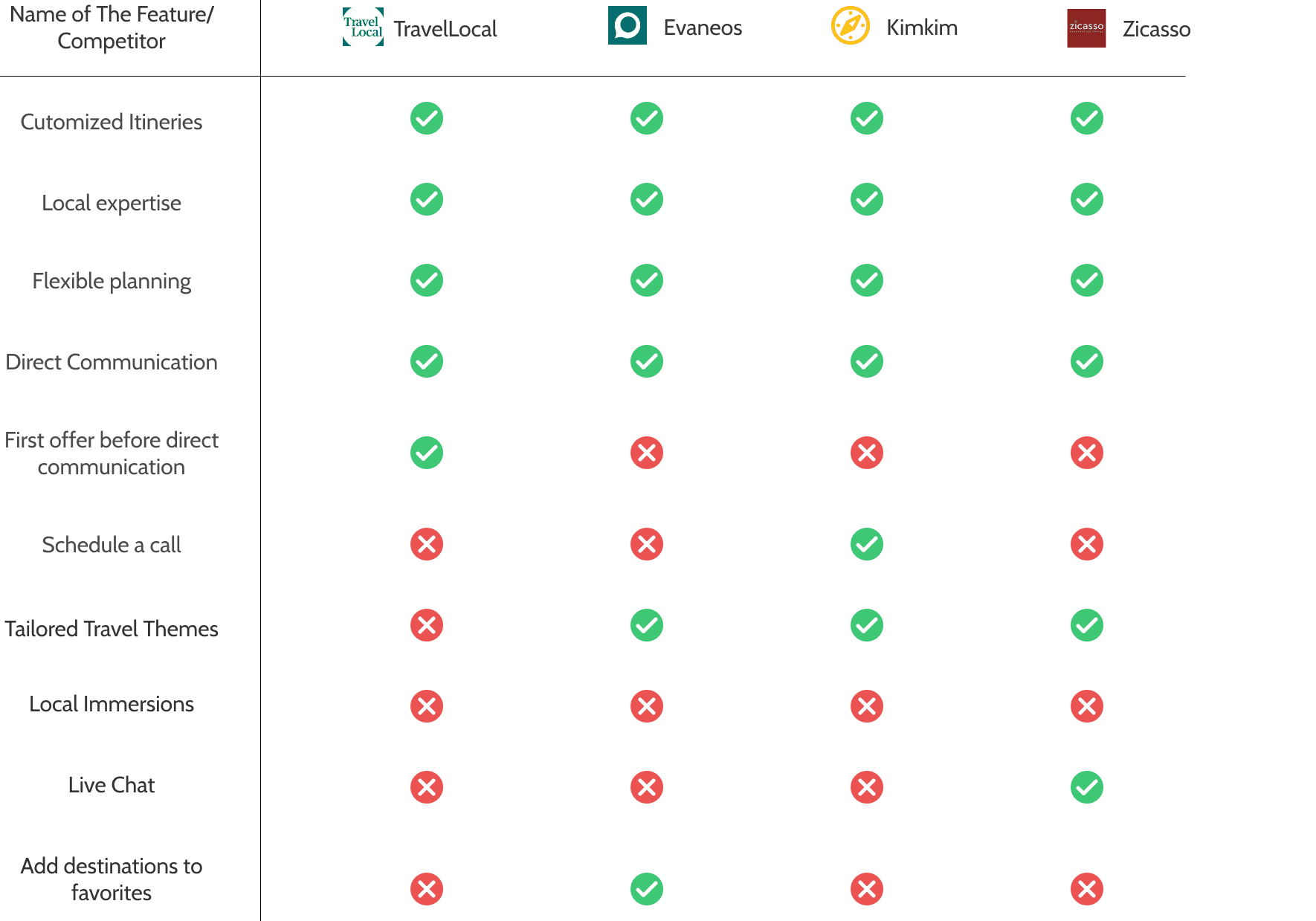
Before delving into the core of the audit, it's crucial to identify opportunities for TravelLocal to improve relative to its competitors. While competitors provide flexible planning and local expertise, TravelLocal lacks features that could enhance user engagement and streamline the journey on the platform. For instance, only Kimkim offers a "Schedule a Call" option, allowing users to directly arrange a call with a local expert.
Before delving into the core of the audit, it's crucial to identify opportunities for TravelLocal to improve relative to its competitors. While competitors provide flexible planning and local expertise, TravelLocal lacks features that could enhance user engagement and streamline the journey on the platform. For instance, only Kimkim offers a "Schedule a Call" option, allowing users to directly arrange a call with a local expert.


How might we help users in following up their traveling plans…
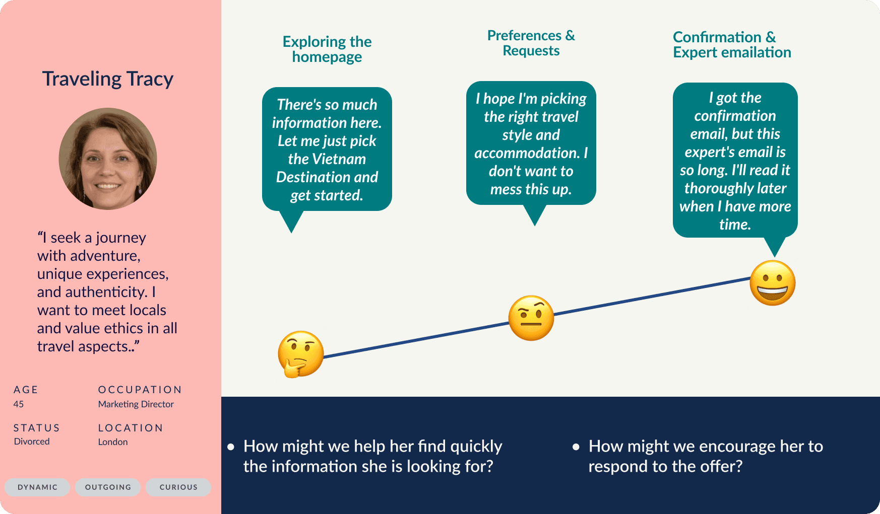
Based on the user persona and user journey map, I identified an issue with the information structure and the clarity of options available for users to plan their itineraries.

Heuristic analysis: key usability issues in navigation and communication
Navigation bar & homepage
Several usability issues on the navigation bar and homepage need attention to improve user experience and clarity.
The site doesn't auto-detect my location, causing frustration and wasted time as users must set it manually. It can also make non-US, EN, DE users feel excluded.
The site doesn't auto-detect my location, causing frustration and wasted time as users must set it manually. It can also make non-US, EN, DE users feel excluded.
The site doesn't auto-detect my location, causing frustration and wasted time as users must set it manually. It can also make non-US, EN, DE users feel excluded.
The wording above the search field is unclear. I don't understand what 'local experts' means. What results can I expect from my action?
The wording above the search field is unclear. I don't understand what 'local experts' means. What results can I expect from my action?
The wording above the search field is unclear. I don't understand what 'local experts' means. What results can I expect from my action?
The B Certification is central to Travellocal's offering & brand positioning but is not sufficiently visible as it is located at the bottom of the page.
The B Certification is central to Travellocal's offering & brand positioning but is not sufficiently visible as it is located at the bottom of the page.
The B Certification is central to Travellocal's offering & brand positioning but is not sufficiently visible as it is located at the bottom of the page.
The various categories lack consistent structure and styling, leading to potential confusion for the reader.
The various categories lack consistent structure and styling, leading to potential confusion for the reader.
The various categories lack consistent structure and styling, leading to potential confusion for the reader.


Itinerary & destination pages
The price for one traveller is not available. I can’t see either what would be the price for a standard accomodation.
The price for one traveller is not available. I can’t see either what would be the price for a standard accomodation.
The price for one traveller is not available. I can’t see either what would be the price for a standard accomodation.
When the "Customize & Request" button is clicked, there is no clear indication that the action has been successfully registered.
When the "Customize & Request" button is clicked, there is no clear indication that the action has been successfully registered.
When the "Customize & Request" button is clicked, there is no clear indication that the action has been successfully registered.
Each itinerary step of the map is unclear and difficult to relate with the itinerary. Moreover not all stops are represented.
Each itinerary step of the map is unclear and difficult to relate with the itinerary. Moreover not all stops are represented.
Each itinerary step of the map is unclear and difficult to relate with the itinerary. Moreover not all stops are represented.


Emails & feedback
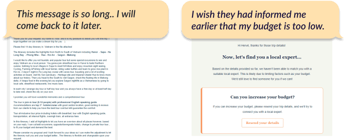
The response from the local expert presents several readability issues, especially on mobile:
The response from the local expert presents several readability issues, especially on mobile:
Text is too long and font size too small for the mobile version.
The text is too lengthy, and font size is too small for the mobile version.
The text is too lengthy, and font size is too small for the mobile version.
Text is too long and font size too small for the mobile version.
The absence of icons or images makes the content feel dense and hard to scan.
The absence of icons or images makes the content feel dense and hard to scan.
No icons or images are used which make it difficult to read.
The next step for the user is unclear, and the Call to Action (CTA) is not prominently placed.
The next step for the user is unclear, and the Call to Action (CTA) is not prominently placed.
No icons or images are used which make it difficult to read.
The website does not indicate that my budget is too low to secure an expert. Receiving this critical information later via email is misleading and may discourage users from returning to the site.
The website does not indicate that my budget is too low to secure an expert. Receiving this critical information later via email is misleading and may discourage users from returning to the site.
The website did not provide any indication that my budget was too low to secure an expert. Receiving this information later via email is misleading and may discourage users from returning to the site.


Visual identity analysis: Evaneos, Kimkim, and G Adventures
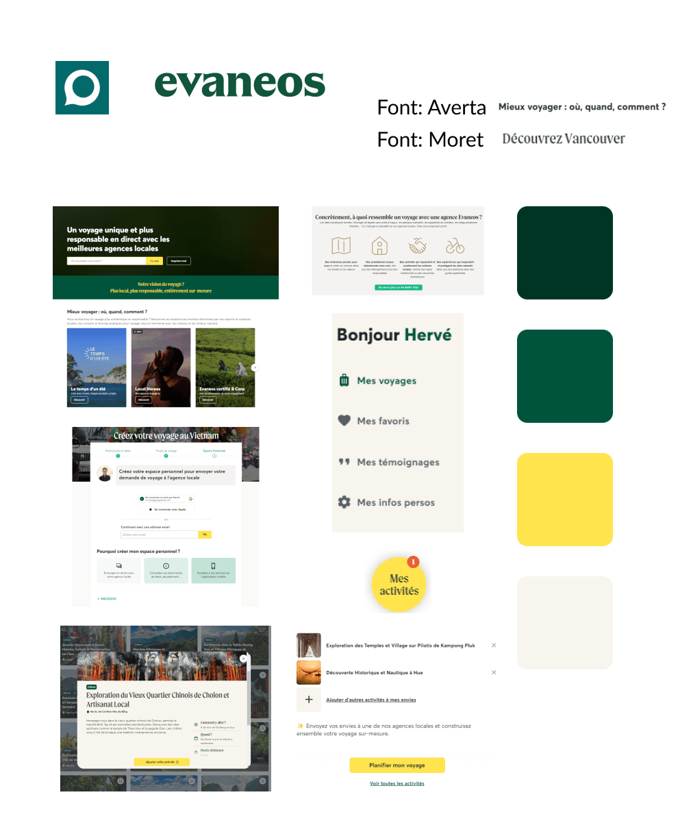
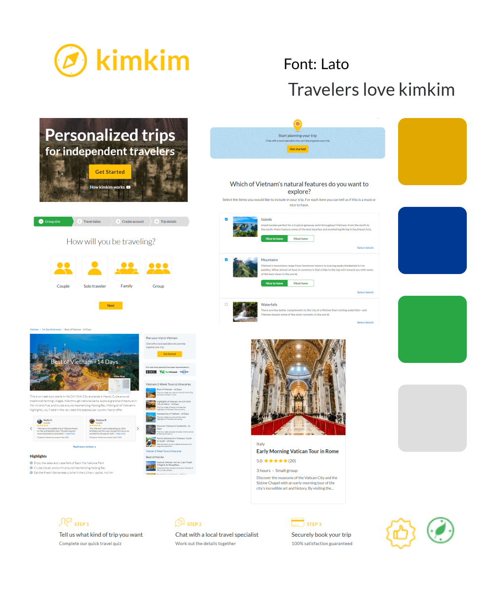
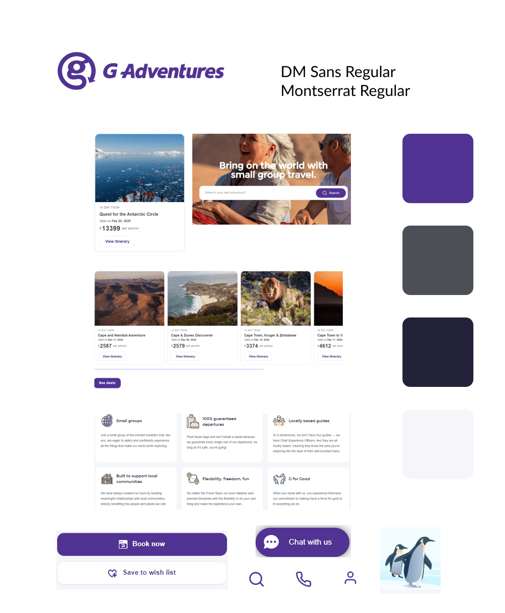
I analyzed the visual identities of Evaneos, Kimkim, and G Adventures, each with distinct brand aesthetics.
I analyzed the visual identities of Evaneos, Kimkim, and G Adventures, each with distinct brand aesthetics.
Evaneos and Kimkim share similar tones with TravelLocal, using green and yellow as primary colors. Evaneos features dark green to represent nature, sustainability, and authenticity, paired with golden yellow for excitement and positivity. Kimkim also emphasizes yellow, complemented by blue and green accents.
Evaneos and Kimkim share similar tones with TravelLocal, using green and yellow as primary colors. Evaneos features dark green to represent nature, sustainability, and authenticity, paired with golden yellow for excitement and positivity. Kimkim also emphasizes yellow, complemented by blue and green accents.
In contrast, G Adventures uses purple as its primary color, symbolizing elegance and exclusivity. G Adventures stands out as the most modern and approachable platform, thanks to its visual focus, rounded boxes and buttons, and engaging icons and illustrations.
In contrast, G Adventures uses purple as its primary color, symbolizing elegance and exclusivity. G Adventures stands out as the most modern and approachable platform, thanks to its visual focus, rounded boxes and buttons, and engaging icons and illustrations.




TravelLocal Brand Identity Moodboard: visualizing authenticity
This moodboard combines images that capture TravelLocal’s core values of authenticity, sustainability, collaboration, and transparency. The photos highlight immersive, real-world travel experiences, emphasizing local cultures, landscapes, and personal connections. The visual style is warm and natural, with soft lighting that creates a sense of comfort and approachability. Each image was carefully chosen to evoke feelings of genuine exploration and discovery, aligning perfectly with TravelLocal’s mission to offer authentic, sustainable travel experiences.
This moodboard combines images that capture TravelLocal’s core values of authenticity, sustainability, collaboration, and transparency. The photos highlight immersive, real-world travel experiences, emphasizing local cultures, landscapes, and personal connections. The visual style is warm and natural, with soft lighting that creates a sense of comfort and approachability. Each image was carefully chosen to evoke feelings of genuine exploration and discovery, aligning perfectly with TravelLocal’s mission to offer authentic, sustainable travel experiences.


Style tile: crafting clarity through colors, typography, and visuals
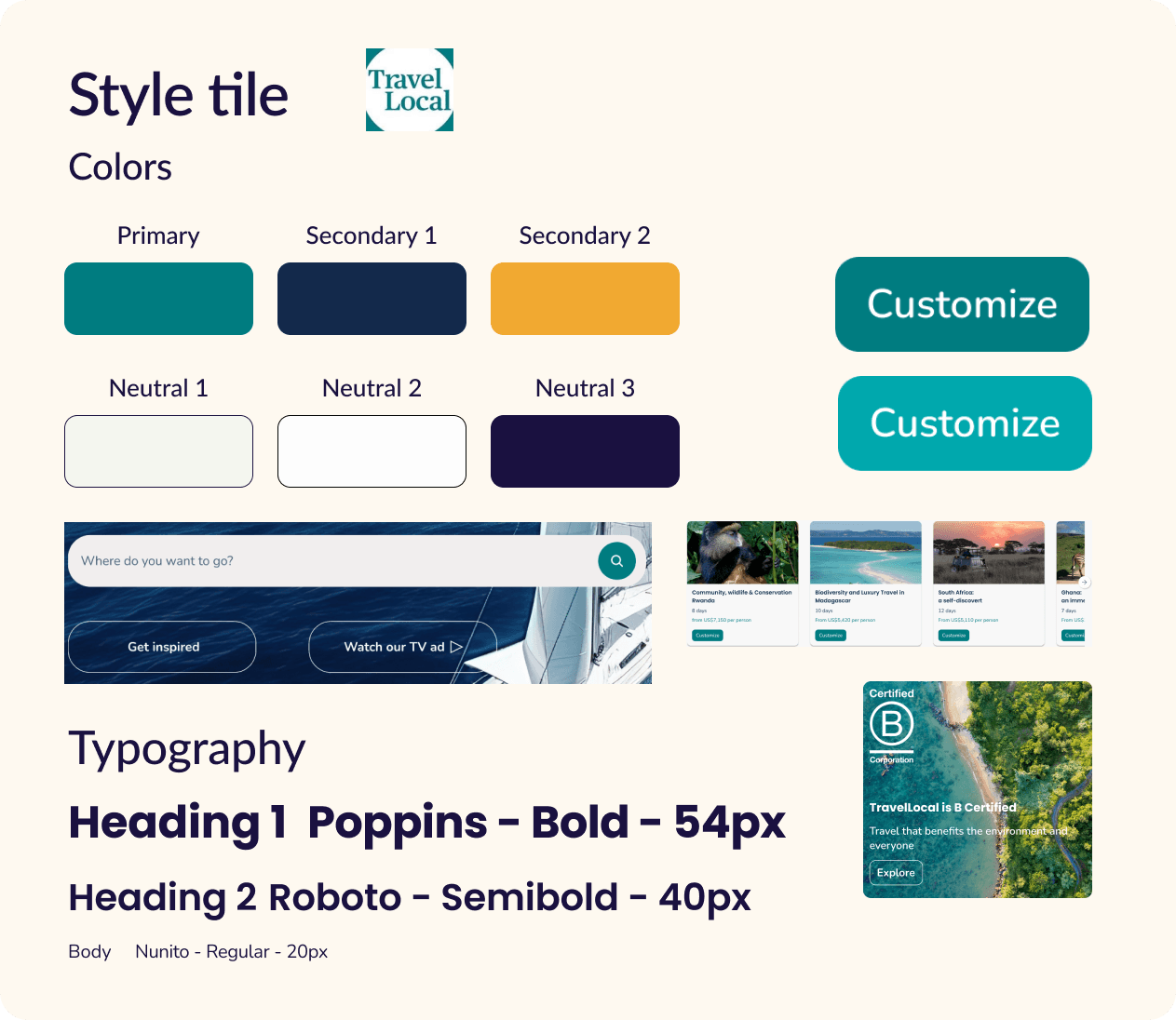
Based on my moodboard, I slightly updated TravelLocal's style tile for the user interface to match better with the brand values
Based on my moodboard, I slightly updated TravelLocal's style tile for the user interface to match better with the brand values
Contrasting colors: I retained TravelLocal's main colors as they reflect the brand's values. Teal green highlights sustainability and authenticity, while dark navy blue and golden yellow represent transparency and collaboration, balancing professionalism and friendliness. I softened the white background with a subtle gray to reduce eye strain and create a warmer feel.
Contrasting colors: I retained TravelLocal's main colors as they reflect the brand's values. Teal green highlights sustainability and authenticity, while dark navy blue and golden yellow represent transparency and collaboration, balancing professionalism and friendliness. I softened the white background with a subtle gray to reduce eye strain and create a warmer feel.
Typography: The combination of Poppins and Nunito offers a modern, clean, and approachable visual language. Their mix of geometric precision and soft curves reflects authenticity and supports clear, human-centered communication—core to TravelLocal's ethos.
Typography: The combination of Poppins and Nunito offers a modern, clean, and approachable visual language. Their mix of geometric precision and soft curves reflects authenticity and supports clear, human-centered communication—core to TravelLocal's ethos.
Imagery and design elements: Rounded corners on icons and buttons, along with larger images, enhance the approachable, human-centered design. Subtle shadows on itinerary boxes highlight the call to action, drawing attention without overwhelming the user.
Imagery and design elements: Rounded corners on icons and buttons, along with larger images, enhance the approachable, human-centered design. Subtle shadows on itinerary boxes highlight the call to action, drawing attention without overwhelming the user.


Final Result: redesign of TravelLocal's homepage
As an example, I chose to redesign TravelLocal's homepage to address some of the UX/UI issues I identified during my audit.
Enhanced visibility to TravelLocal's main services
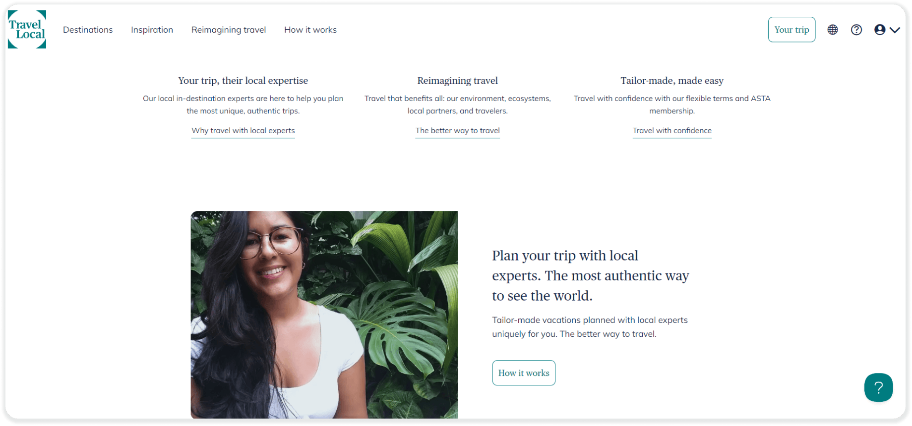
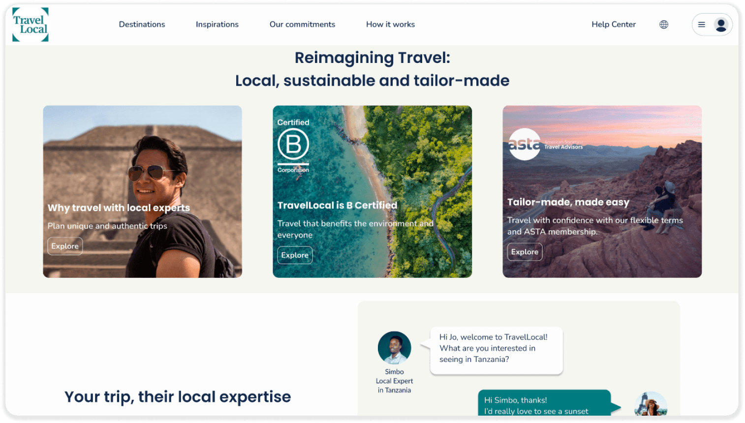
I emphasized the local expertise, B and Asta Certifications by inserting related logos and visuals, as these aspects of local expertise, sustainability, and tailor-made services are fundamental to TravelLocal's offerings. I relocated the 'How it works' infographic for better understanding of what local expertise represents.




Before
Before
Before
After
After
After
Consistent layouts and visual separation
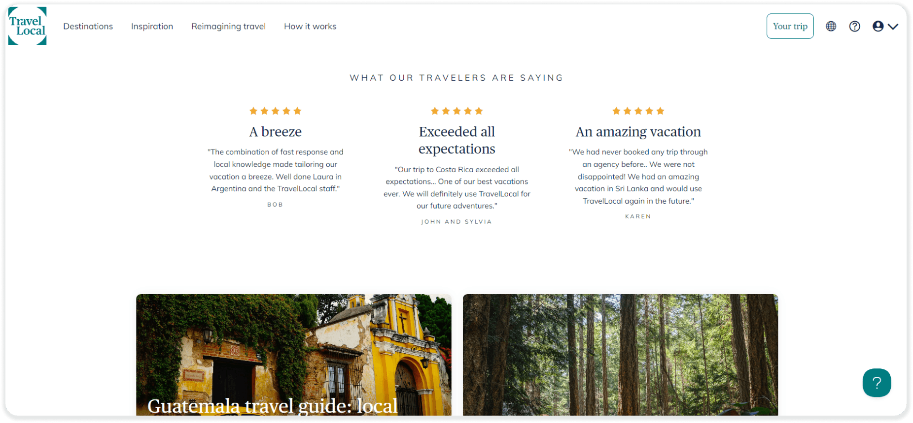
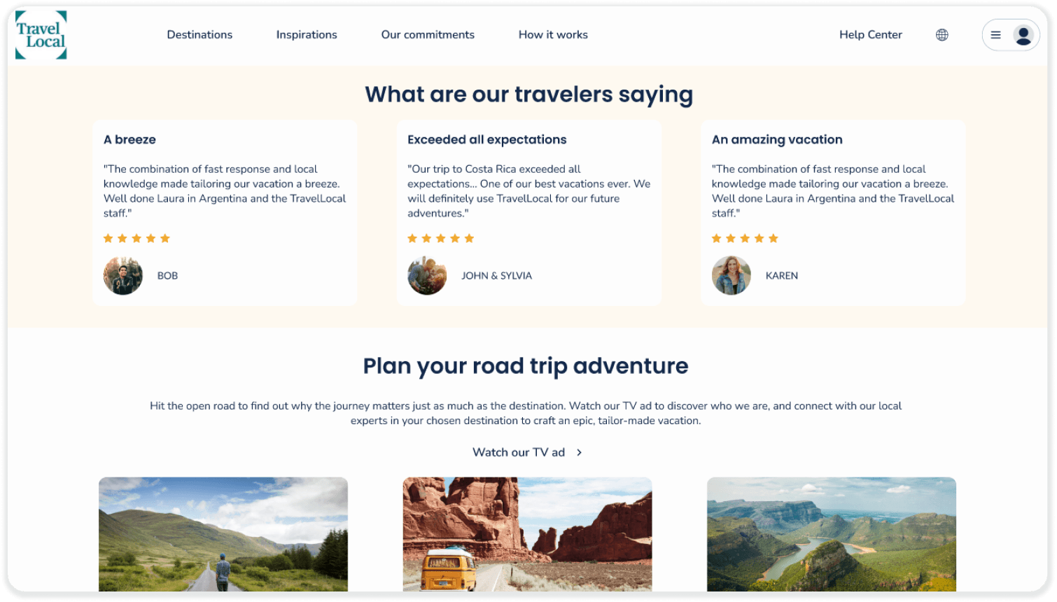
I created consistent layouts across all categories, ensuring uniform headings and structures for better readability. Background colors are used as visual separators to clearly distinguish between sections.




Before
Before
Before
After
After
After
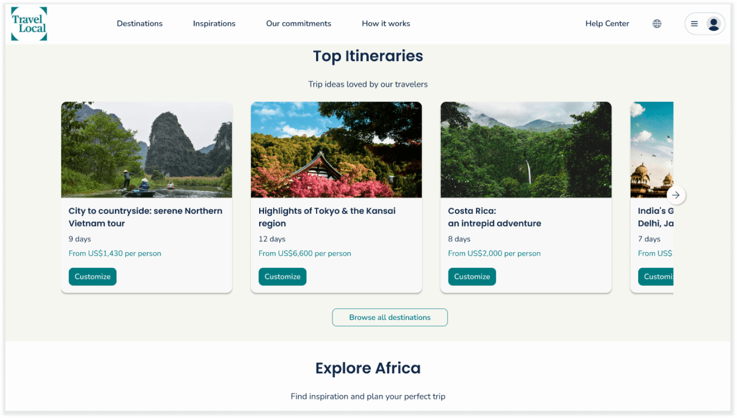
Layout supporting Call to Action
I redesigned the itinerary boxes by enlarging visuals, enhancing description clarity with distinct styling and colors, and making buttons more prominent for stronger calls to action.
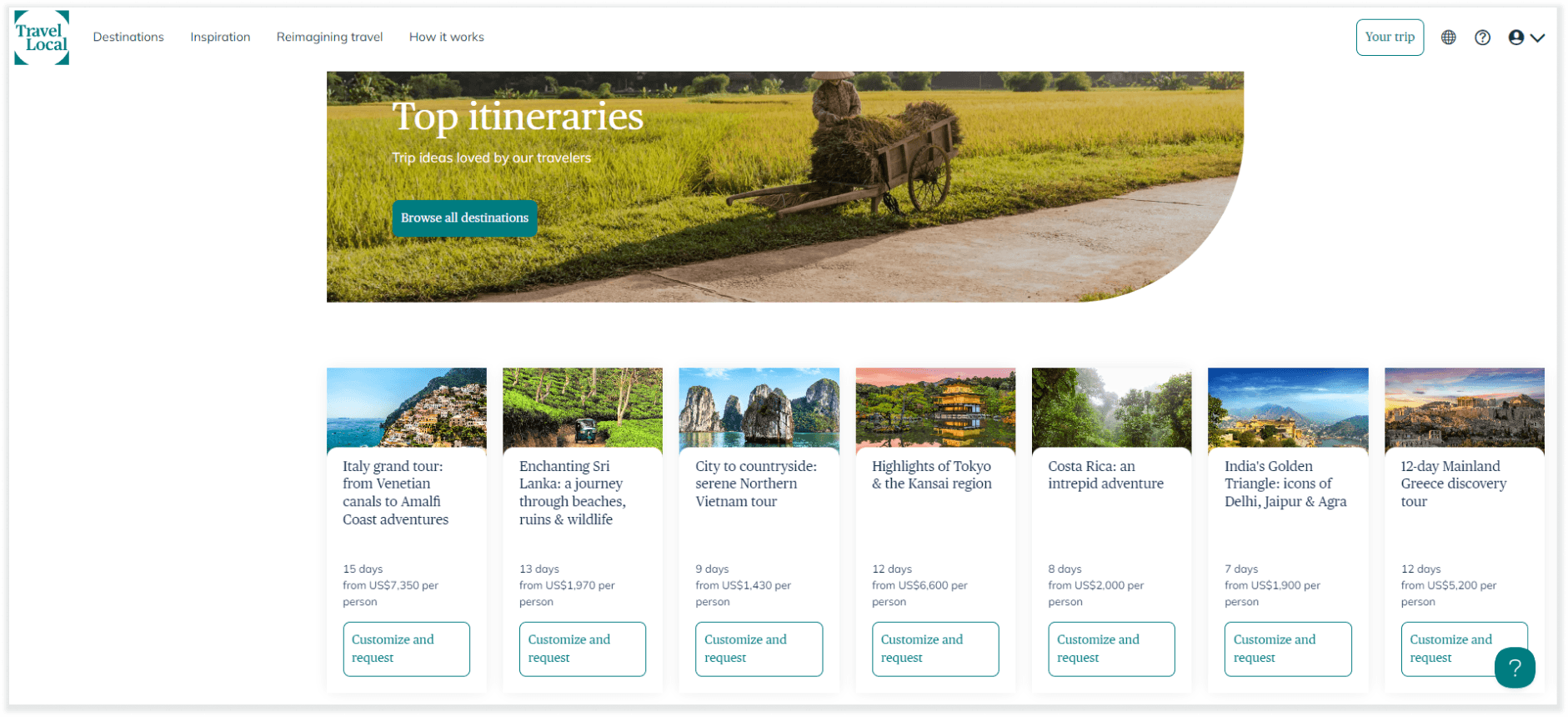




Before
Before
Before
After
After
After
Prototype video
© 2024 Hervé Bon
All rights reserved
Made with

and lots of chocolate

© 2024 Hervé Bon
All rights reserved
Made with

and lots of chocolate

© 2024 Hervé Bon
All rights reserved
Made with

and lots of chocolate

