Couchsurfing
Couchsurfing
Redesigning the most problematic pages of Couchsurfing app


Overview
ROLE
UX/UI Designer
TEAM
Solo project
DELIVERABLES
3 hi fi screens with prototype & 1-2 micro interactions
3 hi fi screens with prototype & 2 micro interactions
DURATION
3 days (21 hours)
Couchsurfing : time for a refresh
I was challenged by Ironhack to redesign at least 3 high-fidelity screens of an app of my choice. As a passionate traveler, I immediately thought of Couchsurfing, which I have used extensively during my recent trips, and recalled that the app was in serious need of a refresh.
As a reminder, Couchsurfing is a social networking platform that connects travelers with locals who offer free accommodations. Users create profiles, find hosts worldwide, and engage in cultural exchange. However, in recent years, Couchsurfing has experienced a decline in popularity. This decline may be partly attributed to the numerous UX and UI flaws observed in the app.
Heuristic analysis
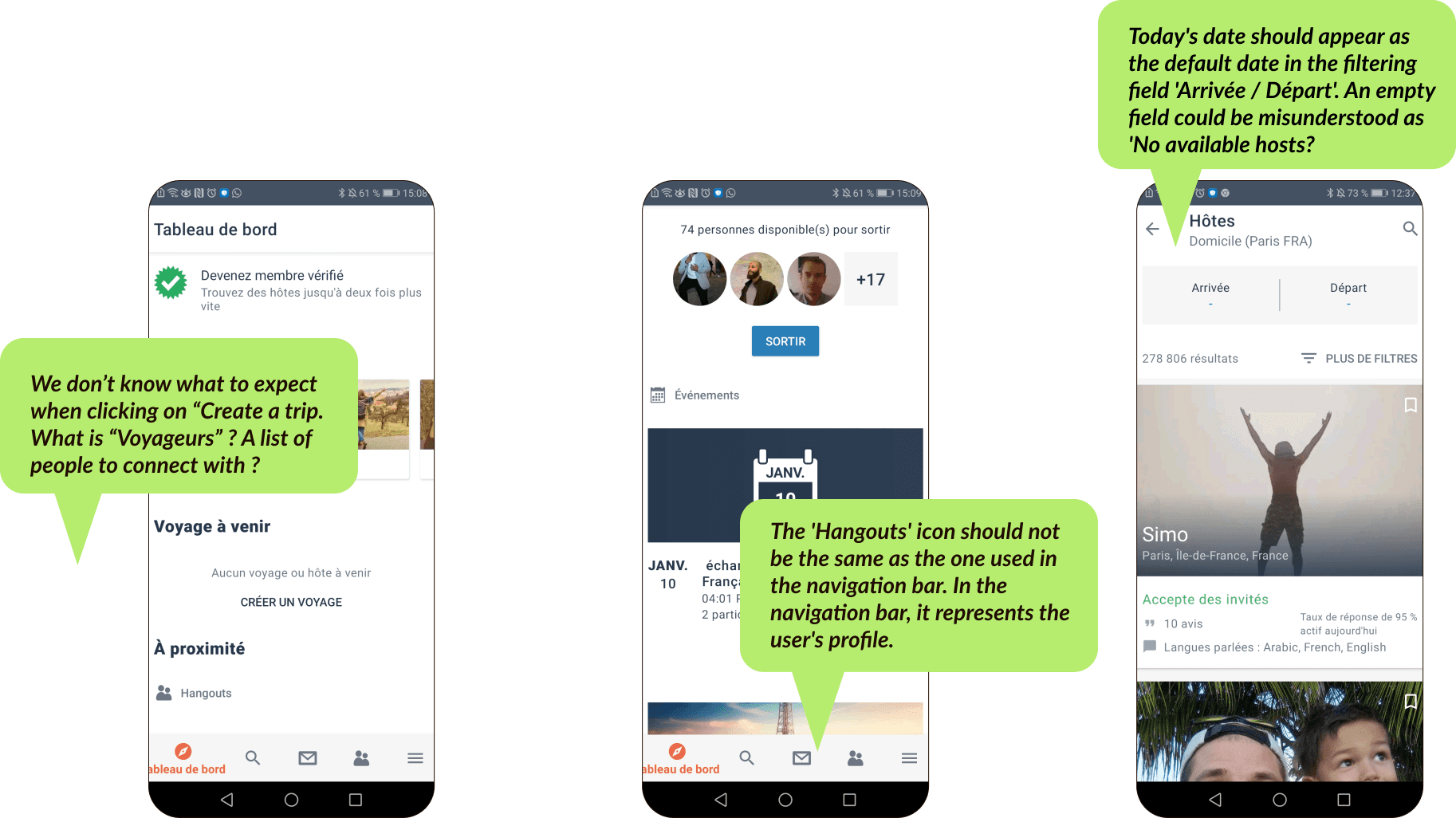
I selected 3 pages of Couchsurfing that I found problematic and conducted a thorough heuristic analysis to enhance my comprehension of the app's usability. I noticed most of the problems in 3 main areas:
Match between system and the real world: The wording is confusing, and we don’t always know what to expect behind categories such as 'names' or 'click to actions.
Consistency and standards: Some icons used in the bottom navigation bar and on different pages of the app are not explicit enough and can be misleading.
Aesthetics and minimal design: Key information does not stand out. The fact that main categories are not clearly separated is one of the main causes.


Visual competitive analysis
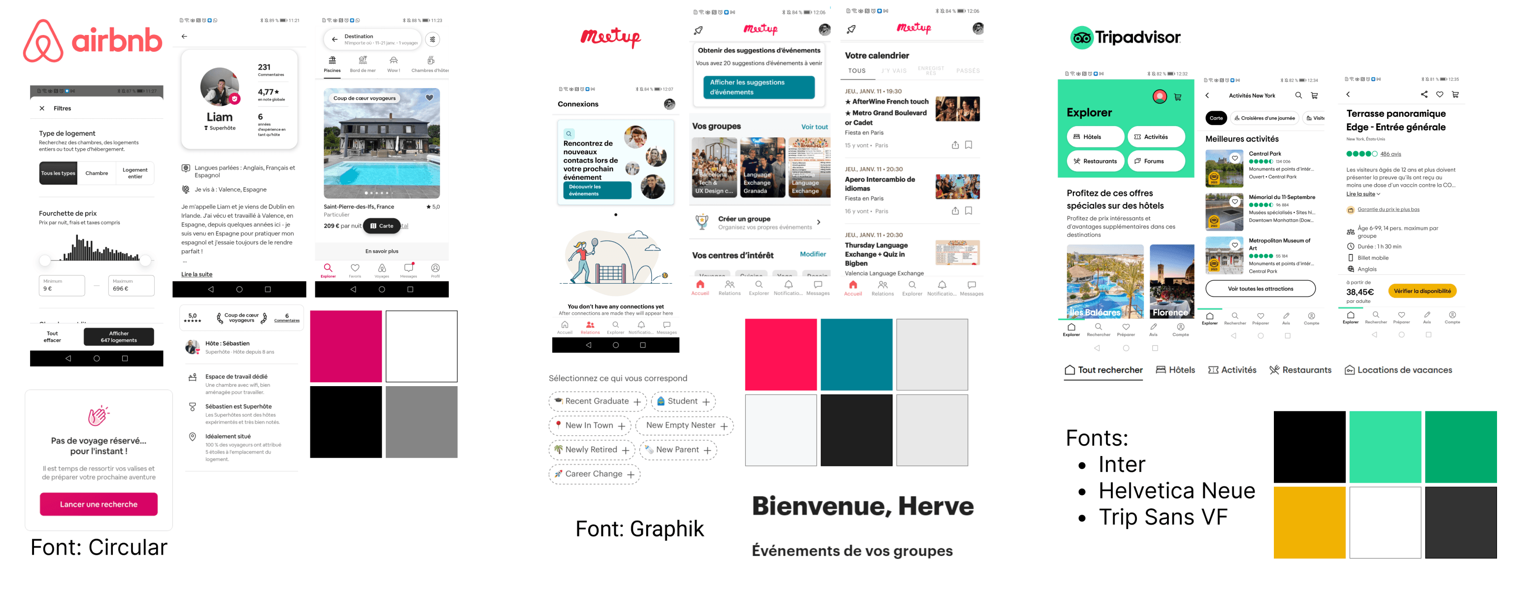
I decided to focus my analysis on Airbnb, Meetup, and TripAdvisor, which are important platforms for travelers looking for local experiences.
Airbnb uses a deep shade of magenta as its primary color, while Meetup uses a shade of pink; both convey a warm and energetic feeling. Whereas Airbnb mainly uses grey and white for secondary and background colors, Meetup opts for additional colors like blue, which counterbalances with a more peaceful feeling. TripAdvisor takes a different color direction, using a primary green which gives a fresh impression, reminding of nature exploration, balanced with a vibrant yellow.


Moodboard
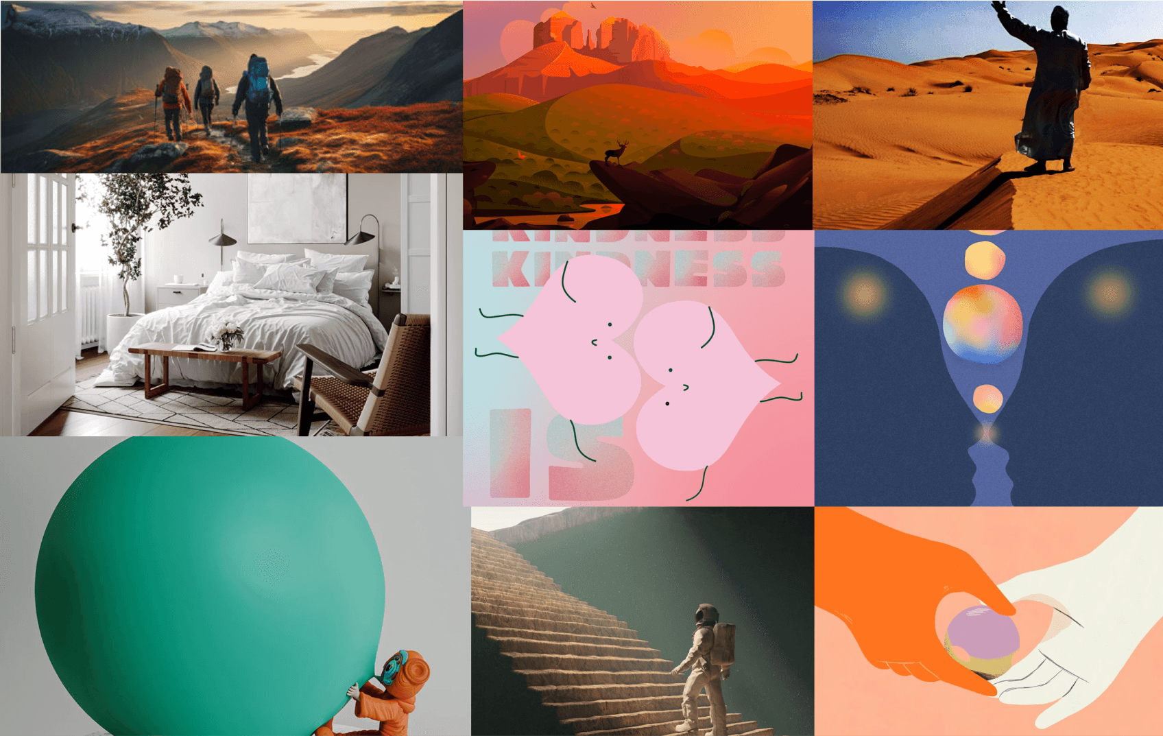
While sharing, kindness and curiosity are important brand attributes of Airbnb, I wanted to add up an adventurous and cozy side that are important characteristics which I think relate well to travellers connecting to the platform.
As you will see on my Style Guide, the following moodboard influenced me a lot to select orange as a primary color and blue as a secondary color. I think that orange conveys well this feeling of adventure and warm welcoming, while blue is calming, represents the horizon of great spaces you takes time to admire and that brings a sense of balance and serenity when travelling.


Visual identity


Final result
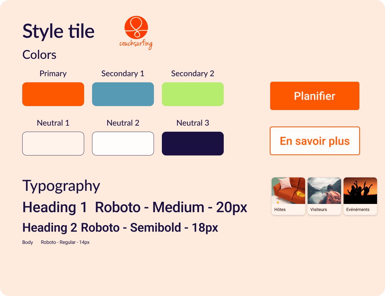
On the whole, my primary color (orange) is primarily used for my call-to-action (CTA) buttons and to provide structure by using it to delineate different categories
On the whole, my primary color (orange) is primarily used for my call-to-action (CTA) buttons and to provide structure by using it to delineate different categories
On the whole, my primary color (orange) is primarily used for my call-to-action (CTA) buttons and to provide structure by using it to delineate different categories
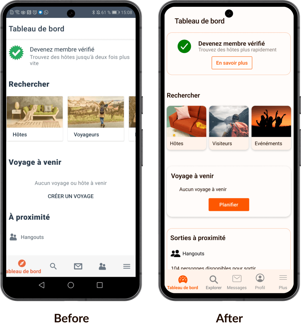


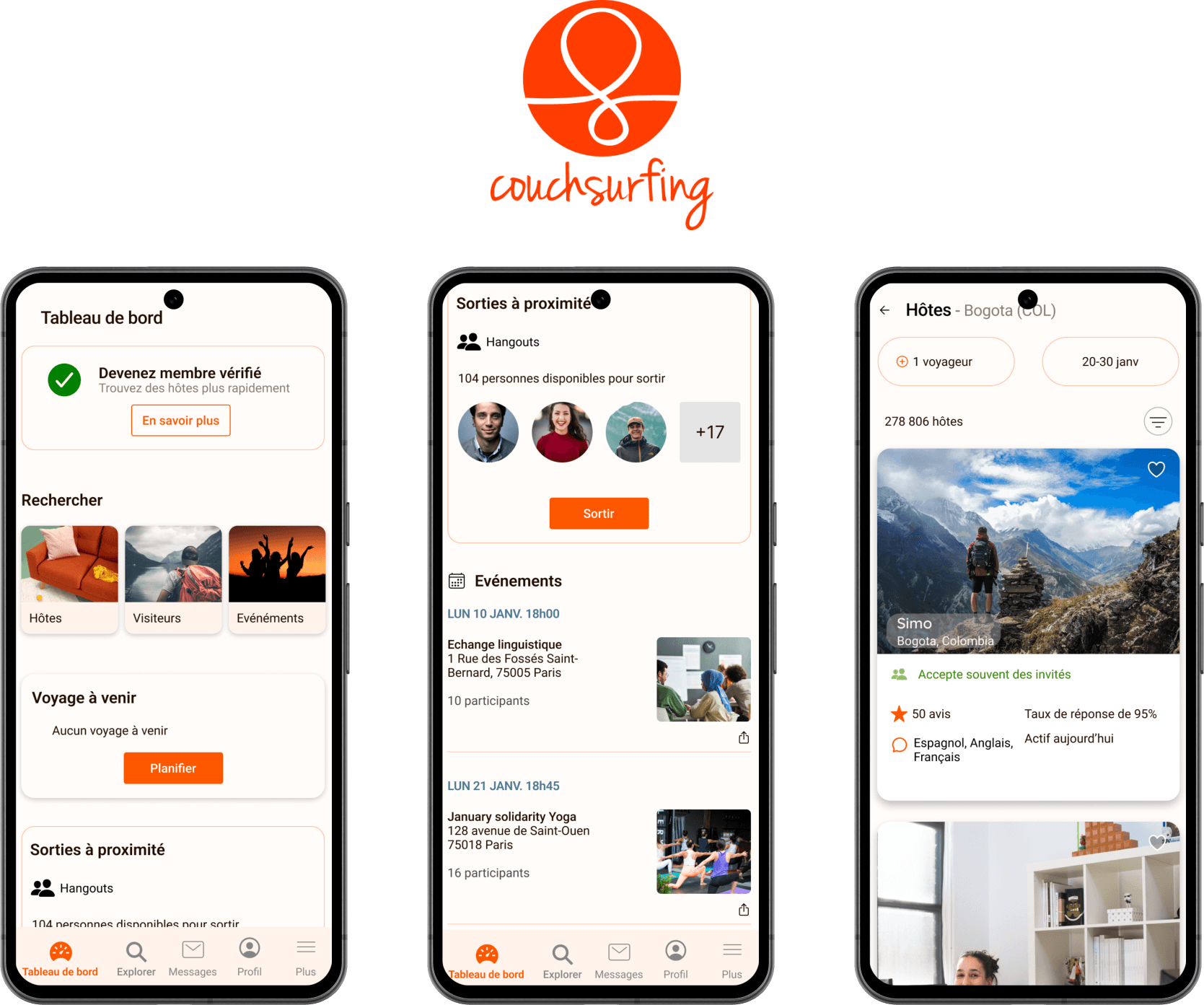
Categorization: I decided to outline each category more clearly with strokes, lines, and shades, distinguishing important contents of the page.
Slider: I removed the horizontal scrolling for the three categories 'Hôtes', 'Visiteurs', and 'Événements' to have them all visible on the screen at once. I found it unnecessary to scroll just to access one more category.
CTA: I added a button for 'Devenez membre vérifié' and 'Voyage à venir' because we were unsure about which action to take when viewing these fields.
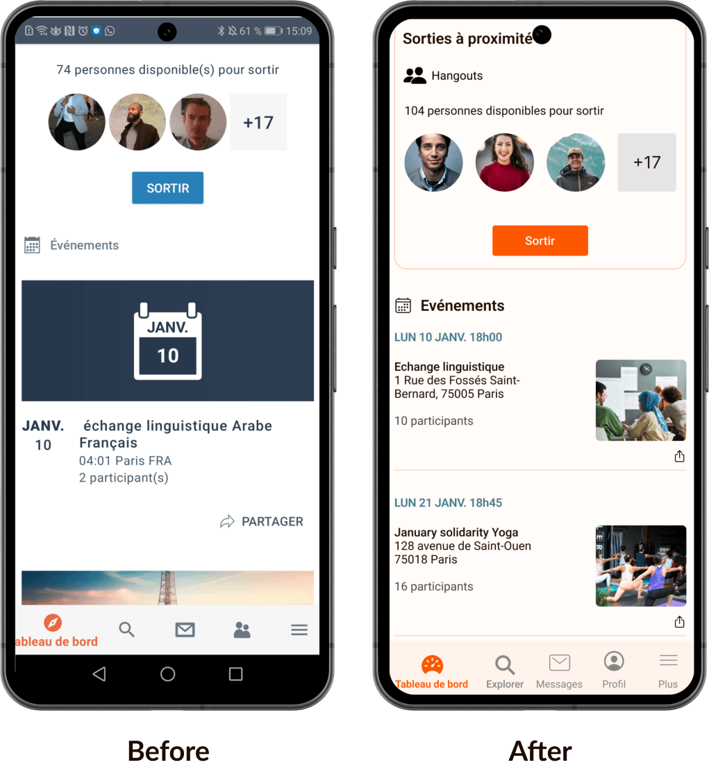


Reorganization of the event section: I reshaped the structure to provide a better overview.
Icons: I added a legend to each icon in the navigation bar and changed the profile icon to improve clarity
Reorganization of the event section: I reshaped the structure to provide a better overview.
Icons: I added a legend to each icon in the navigation bar and changeed the profile icon to improve clarity
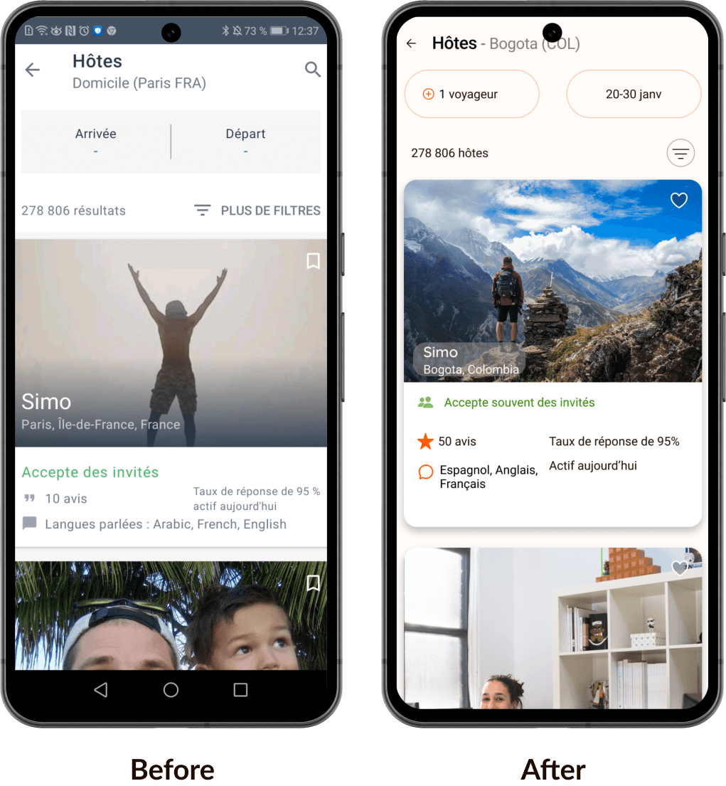


Search: I reshaped the search field and added a default date to avoid confusion.
Hosts' profiles: I added a shade and rounded corners to the profiles to help them stand out better, as users might want to view more details about their chosen host.
Prototype video
© 2024 Hervé Bon
All rights reserved
Made with

and lots of chocolate

© 2024 Hervé Bon
All rights reserved
Made with

and lots of chocolate

© 2024 Hervé Bon
All rights reserved
Made with

and lots of chocolate
